

If you’re reading this, you probably already know that Google cares about how your website works on mobile devices. You might even have a responsive design and assume everything’s fine. But there’s a good chance your site isn’t as optimized as you think it is, and that’s affecting how well you rank in search results.
This guide is going to walk you through what mobile-first indexing actually means, what Google’s paying attention to, and what you need to fix on your site to make sure you’re not losing traffic for no good reason.
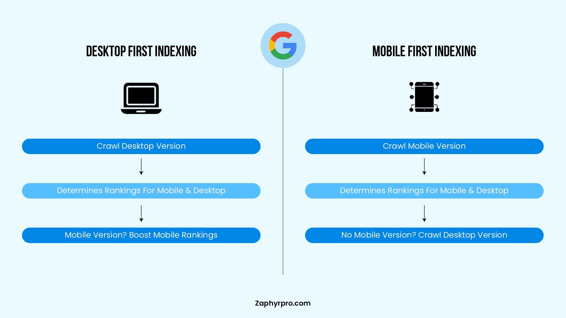
Difference Between Desktop-First Indexing vs. Mobile-First Indexing
What is Google’s Mobile-first Indexing in SEO?
Google’s Mobile-First Indexing means that Google predominantly uses the mobile version of a website for indexing and ranking. The rollout was fully completed on July 5, 2024, and mobile-first is now the universal default for 100% of websites, as there are no longer any desktop-only crawling exceptions.
When Googlebot crawls and indexes a website, it prioritizes the mobile version instead of the desktop version. If a site doesn’t have a mobile-friendly design or lacks important content on mobile, it could suffer from lower rankings in Google search results.
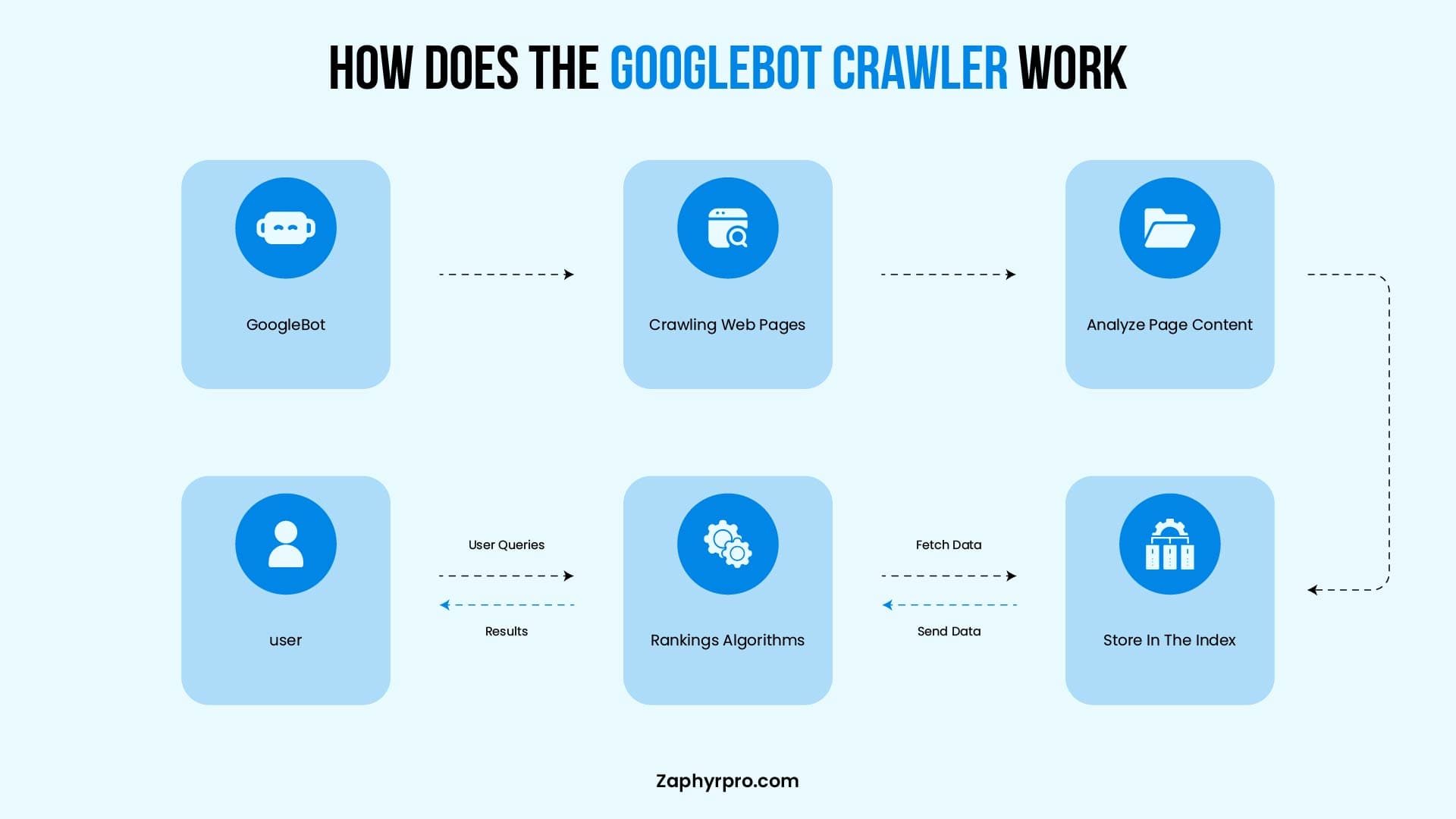
The Role of Googlebot mobile crawling includes:
- Crawling & Indexing: Googlebot fetches pages, follows links, and stores content in Google’s index.
- Mobile Usability Analysis: Detects issues like unreadable text, unclickable elements, or slow loading speeds.
- Rendering & Content Matching: Ensures that the mobile version contains the same critical information as the desktop version.
If a site is not optimized for mobile, Googlebot may encounter difficulties in properly crawling, indexing, or ranking it. This can lead to lower visibility in Google search results.
What are the SEO risks of ignoring mobile-first indexing?
Google’s Mobile-First Indexing directly influences search rankings and organic traffic, as the mobile version of a website is the primary basis for crawling, indexing, and ranking determinations. If your site is not optimized for mobile, you risk:
- Lower rankings in Google search results due to poor mobile usability and Core Web Vitals.
- Reduced organic visibility, especially in mobile searches which dominate traffic.
- Higher bounce rates, as users abandon slow or unresponsive mobile pages.
A well-optimized mobile site improves user experience (UX), page speed, and engagement, all contributing to better SEO performance through stronger signals like dwell time and lower pogo-sticking.
Googlebot prioritizes mobile-friendly pages for higher rankings because they deliver smoother experiences, leading to better engagement, longer sessions, and higher conversions.
Why Did Google Introduce Mobile-First Indexing?
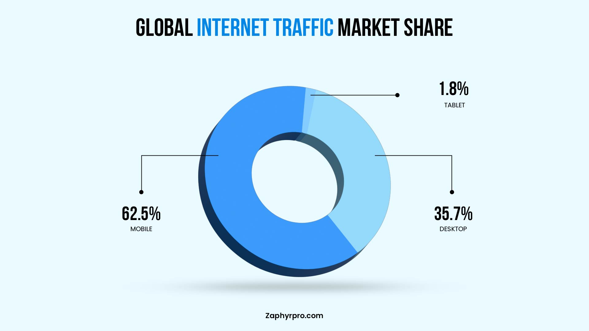
Google’s journey toward mobile-first indexing began over nine years ago, driven by the massive shift in user behavior as mobile devices became the primary way people access the internet. As mobile traffic surpassed desktop usage, Google aimed to make its search results better reflect the actual mobile user experience.
Mobile-first indexing prioritizes the mobile version of websites for crawling, rendering, indexing, and ranking. This makes strong mobile optimization a critical factor for SEO success.
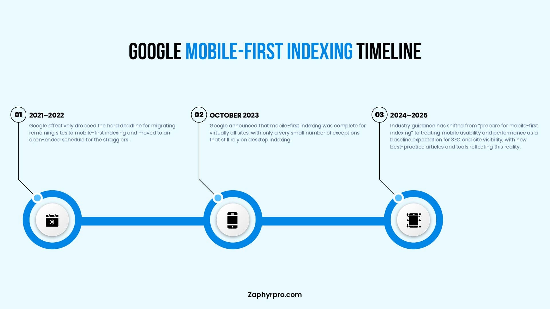
In October 2023, Google announced substantial completion that Mobile-First Indexing is now fully rolled out.
This signified substantial rollout completion after years of gradual expansion from mobile-friendly sites to all domains. By July 5, 2024, Google fully transitioned remaining desktop-crawled sites to mobile crawling, making it the default for 100% of indexed websites. As of 2026, mobile-first indexing remains fully in effect with important new developments.
But why did Google make this change?
1. More People Using Mobile Phones
Mobile internet usage has surged dramatically over the past decade. In Q1 2026, mobile devices (excluding tablets) accounted for approximately 52-54% of global website traffic (with some sources reporting 53-65% depending on methodology and inclusion of tablets). Mobile remains the dominant way people browse, shop, and search, prompting Google to align its indexing with real user behavior.
2. “Mobilegeddon” and the Push for Mobile-Friendly Sites
In April 2015, Google launched the “Mobilegeddon” which rewarded mobile-friendly sites with better rankings and demoted non-responsive ones. This was a major wake-up call that pushed businesses to prioritize mobile design.
3. The Move to Mobile-First Indexing
Building on Mobilegeddon and rising mobile traffic, Google shifted to primarily using the mobile version (crawled by Googlebot Smartphone) for indexing and ranking. This ensures search results are more relevant for the majority of users while putting sites with poor mobile experiences at a disadvantage.
4. September’s Algorithm Update
The September 2025 core update (nicknamed “Perspective”) reinforced mobile performance as a stronger ranking factor alongside content quality and Core Web Vitals. Sites with consistently poor mobile metrics (e.g., LCP >2.5 s or high layout shifts) can see significant ranking drops and reduced visibility, but not complete removal from the index. This simply amplified existing penalties for bad mobile experiences.
5. Ongoing Reinforcement in 2026
Mobile performance continues to be a major ranking signal in 2026. Google’s core updates (including the March 2026 Core Update) have further emphasized user experience signals, with particular weight on mobile Core Web Vitals, seamless interactivity, and content parity between versions.
Key Factors That Affect Mobile SEO Performance
Some factors include:
- Core Web Vitals for Mobile.
- Mobile (UX) in SEO rankings.
- Role of Mobile Page Speed Optimization in SEO.
1. Core Web Vitals for Mobile
Core Web Vitals are a set of performance metrics used by Google to measure the user experience on mobile sites. These metrics are crucial for mobile SEO performance and directly impact search rankings.
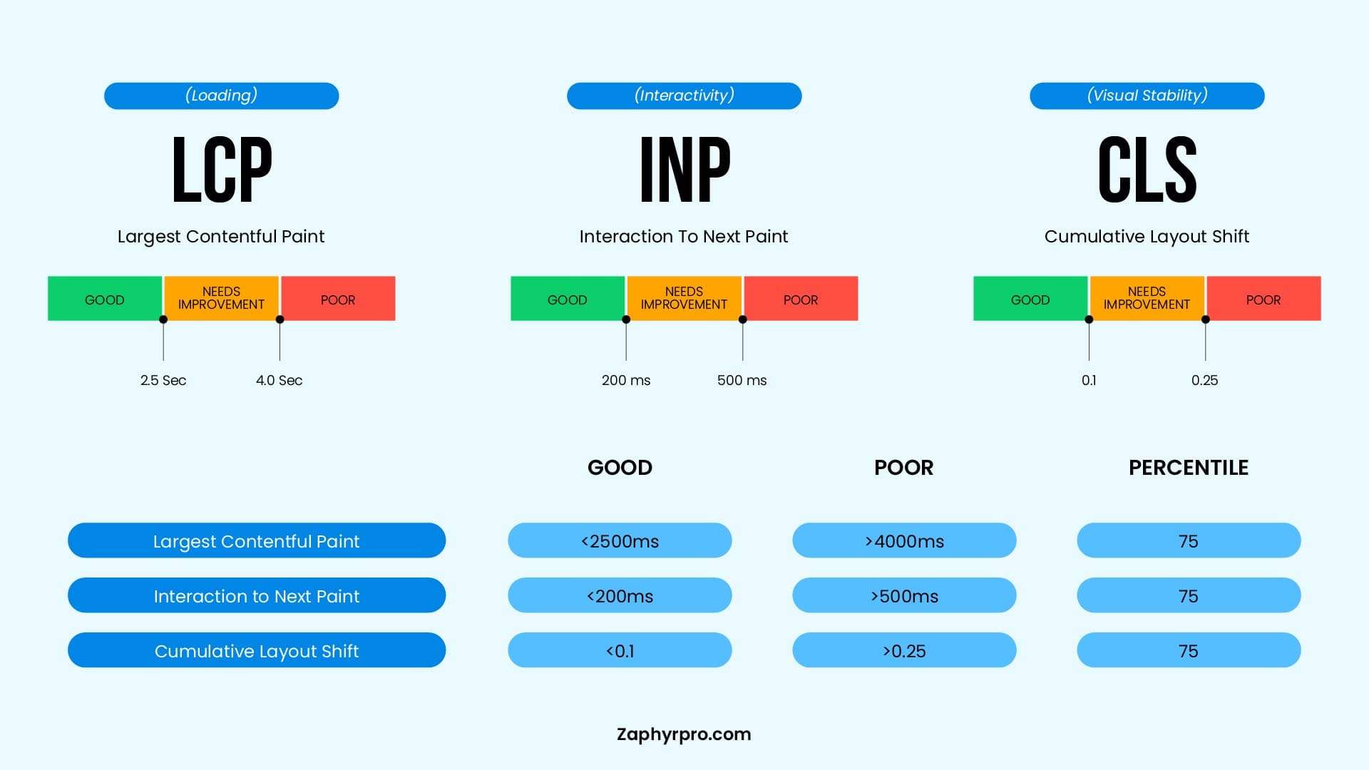
The three main Core Web Vitals for mobile are:
Largest Contentful Paint (LCP)
LCP measures how long it takes for the largest element on a page (such as an image, video, or text block) to load and become visible to the user. For a good user experience, LCP should occur within 2.5 seconds. A slow LCP could indicate that your mobile page is loading slowly, leading to a poor mobile experience and a drop in rankings.
Interaction to Next Paint (INP)
INP measures the responsiveness of your page to user interactions throughout the entire page lifecycle. It tracks the time from when a user interacts with your page (clicking a button, tapping a link, or entering text) to when the browser presents visual feedback on the screen. A good INP should be 200 milliseconds or less.
Unlike the older First Input Delay metric, INP evaluates all interactions on a page, not just the first one, and reports the worst interaction score. High INP can lead to frustration and a higher bounce rate, as users feel the site is sluggish or unresponsive.
Cumulative Layout Shift (CLS)
CLS measures how stable your page is as it loads. It tracks unexpected shifts in layout that can cause content to jump around, like buttons or text moving when the page is still loading. For a good experience, CLS should be under 0.1. High CLS can frustrate mobile users, especially when they accidentally click on the wrong element due to shifting content.
Together, these Core Web Vitals ensure that mobile users have a fast, responsive, and stable experience, which ultimately boosts mobile SEO performance.
2. Mobile User Experience (UX) SEO in Rankings
Mobile user experience (UX) is a critical factor for SEO success. Google values websites that provide a seamless and enjoyable experience for mobile users. Key elements that affect UX and conversion rates include:
- Responsive Design: A website should automatically adjust to different screen sizes and orientations.
- Easy Navigation: Simple and intuitive menus, touch-friendly buttons, and easy-to-read text.
- Readability: Ensure fonts are large enough to read on smaller screens, and content isn’t hidden behind scrollable elements.
- Interactivity: Interactive elements, like forms and buttons, should be quick and responsive without delays.
Google increasingly considers UX signals when determining rankings, and sites that provide poor mobile UX may experience lower rankings and reduced visibility in search results. Additionally, a positive mobile UX increases user engagement and conversion rates, which further contributes to SEO success.
3. Role of Mobile Page Speed Optimization in SEO
Mobile page speed optimization is crucial for both user experience and SEO performance. Slow-loading mobile pages can lead to frustration and high bounce rates, directly impacting your rankings. Several factors contribute to mobile page speed, including:
- Image Optimization: Compress images without sacrificing quality to reduce load times.
- Lazy Loading: Load images and content only when users scroll to them, improving initial page load time.
- Minification of CSS and JavaScript: Remove unnecessary code to speed up the page loading process.
- Server Response Time: A fast server ensures that mobile pages load quickly.
- AMP (Accelerated Mobile Pages): Consider using AMP to enhance load speed on mobile devices.
Faster mobile pages contribute to better user retention, lower bounce rates, and increased engagement, all of which are positive signals for Google’s ranking algorithms. Optimizing mobile page speed is essential for ensuring your site remains competitive in search results.
Mobile-First Indexing Checklist for Better Rankings
To ensure your website is fully optimized for Google’s Mobile-First Indexing, follow this checklist to boost your rankings and overall mobile SEO performance. Each factor plays a critical role in improving your mobile visibility and enhancing the user experience for mobile users.
1. Technical SEO for Mobile
Technical SEO is the backbone of a successful mobile optimization strategy. These steps ensure that Google can properly crawl and index your mobile site:
Proper Crawling
Ensure that Googlebot mobile can access and crawl your mobile site without restrictions. Use robots.txt to confirm that Googlebot is not blocked from any important resources (images, JavaScript, CSS files, etc.).
No Blocked Resources
Check for any blocked resources that could prevent Google from fully understanding your mobile content. Use Google Search Console to monitor crawling issues and resolve them promptly.
Use the Mobile Usability Report in Search Console to identify issues specific to mobile crawling.
Correct Hreflang Tags
If you serve content in multiple languages or regions, ensure you use hreflang tags correctly for your mobile pages. This helps Google understand which mobile versions of pages are relevant for users in specific regions and languages. Incorrect hreflang tags can lead to issues with serving the correct version of your site to users and impact international SEO.
Mobile Sitemaps
Make sure your sitemap reflects mobile pages and is up-to-date. This ensures Googlebot can crawl all important mobile content efficiently.
2. Mobile-Friendly Website Design
A mobile-friendly design is essential for both user experience and SEO. Google prioritizes sites that deliver seamless mobile experiences. Here’s how to optimize your design:
Responsive Layouts:
Ensure your website has a responsive design, meaning it automatically adjusts to different screen sizes (smartphones, tablets, etc.). Avoid using separate URLs for mobile and desktop versions (e.g., m.example.com vs. www.example.com). Instead, use a single URL that adapts to the user’s device.
Touch-Friendly Buttons & Navigation:
Mobile users rely on touch gestures, so make sure buttons and links are large enough to be easily clickable without accidental taps. Use spacious, intuitive navigation and avoid overcrowding elements on smaller screens.
Optimized Images:
Image size and quality are crucial for mobile SEO. Use compressed images to reduce load time while maintaining quality. Also, consider using responsive images (with different sizes for different screen resolutions) to ensure that they load quickly without compromising visual appeal.
Readable Text:
Make sure fonts are legible without zooming. Use large, clear text and proper line spacing for easy readability on small screens.
3. Schema Markup for Mobile SEO
Schema markup helps Google understand the content of your page and enhances how your page appears in search results, particularly on mobile devices. It plays a crucial role in improving your rich snippets and mobile visibility:

Structured Data for Rich Snippets:
Implement schema.org markup to enhance mobile results with rich snippets like reviews, ratings, product details, event times, and more. Rich snippets improve visibility and click-through rates (CTR), especially on mobile search results.
Mobile-Specific Markup:
Ensure that your schema types for websites work across both mobile and desktop versions of your site. For example, ensure the markup for articles, products, or events is applied consistently, regardless of the device being used.
Testing & Validation:
Use the Structured Data Testing Tool to ensure your mobile schema markup is correctly implemented. Invalid or missing markup can prevent your rich results from displaying correctly on mobile.
How to Optimize Your Website for Google’s Mobile-First Indexing
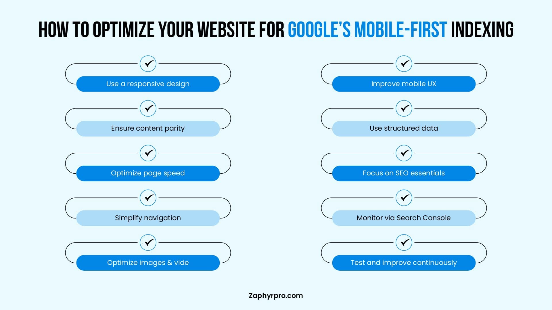
Optimizing your website for Google’s Mobile-First Indexing is crucial to ensure that it ranks well in search results and provides a seamless experience for mobile users. Below are key steps to effectively optimize your website for mobile-first indexing.
1. Conducting a Mobile-Friendliness Test and Fixing Issues
To begin the optimization process, it’s essential to evaluate how well your website performs on mobile devices. Google’s Mobile-Friendly Test is a great tool to check whether your site meets the mobile-first standards. Here’s how to use it:
Run the Mobile-Friendly Test:
Go to the Google Mobile-Friendly Test and input your website’s URL. The tool will analyze how well your page performs on mobile devices and provide a detailed report.
Review the Results:
If Google flags any issues (such as text being too small, links being too close together, or slow load times), take note of them. It will also offer suggestions on how to improve the mobile usability of your site.
Fix Mobile Usability Issues:
Based on the test results, fix common mobile-friendly issues, such as:
Adjusting Text Size:
Ensure that the font is large enough to be read without zooming.
Fixing Navigation Issues:
Improve your site’s navigation by making menus and buttons touch-friendly.
Optimizing Touch Targets:
Ensure buttons and clickable elements are large enough and spaced appropriately for easy tapping on mobile.
Once you’ve resolved these issues, retest your website to ensure everything is working correctly.
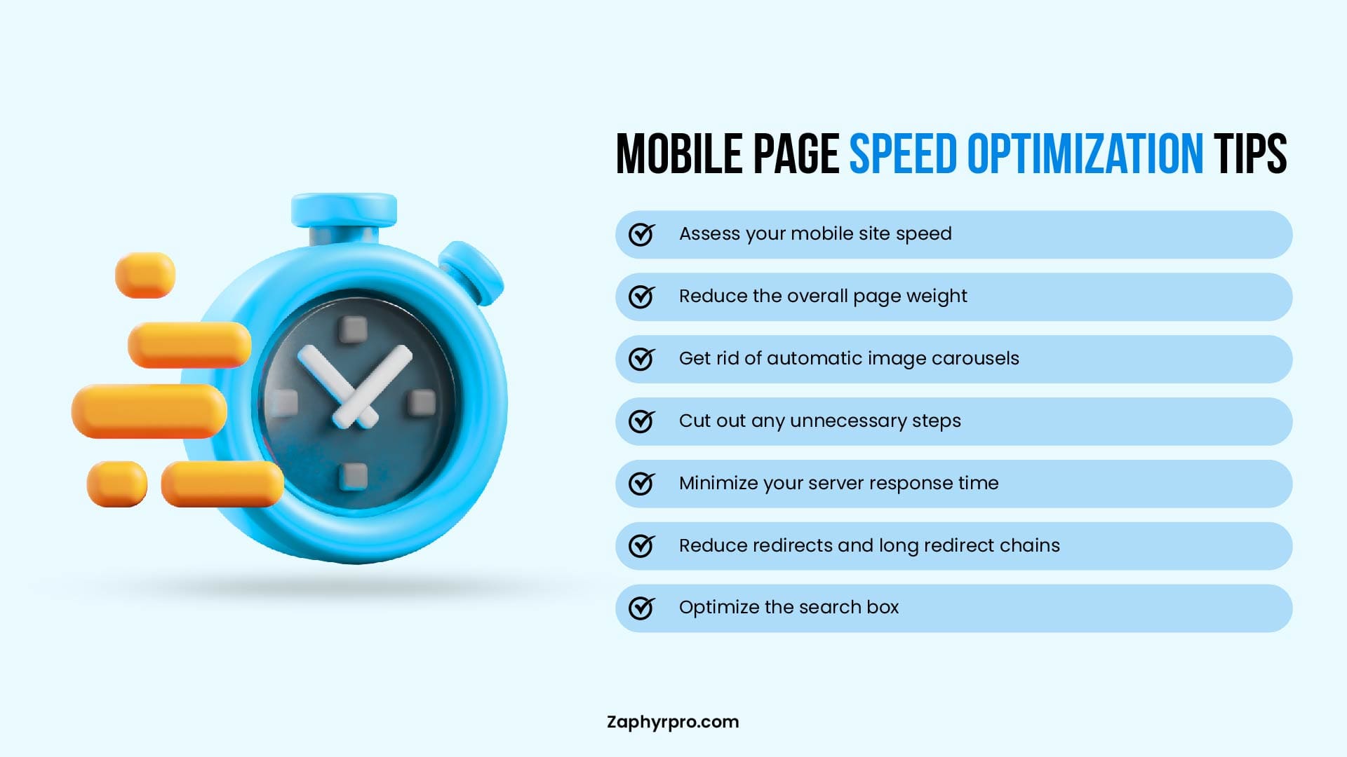
2. Best Practices for Mobile Page Speed Optimization
Page speed is a critical ranking factor, especially for mobile-first indexing. A slow-loading website can significantly affect your rankings, bounce rates, and user satisfaction. Follow these best practices to optimize mobile page speed:
Image Optimization
Large images can slow down page load times. Use compressed images without sacrificing quality and implement responsive images that automatically adjust to different screen sizes. Tools like ImageOptim and TinyPNG can help you reduce image sizes.
Minify CSS, JavaScript, and HTML
Remove unnecessary code and spaces from your CSS, JavaScript, and HTML files to reduce file sizes. Use tools like UglifyJS or CSSNano to minify these files.
Leverage Browser Caching
Enable browser caching to ensure that your site’s static resources (like images, stylesheets, and scripts) are cached in users’ browsers. This reduces load times for returning visitors.
Enable Lazy Loading
Lazy loading defers the loading of images and videos until they are needed (when the user scrolls to them). This helps speed up initial page load times, especially for content-heavy pages.
Use a Content Delivery Network (CDN)
A CDN stores copies of your site on multiple servers around the world, which reduces the distance between your server and the user, speeding up content delivery.
AMP (Accelerated Mobile Pages)
For sites where speed is a top priority (like news sites or blogs), implementing AMP can drastically improve load times by delivering lightweight pages. However, AMP is not mandatory for most websites, and focusing on Core Web Vitals may be sufficient.
Improve Server Response Time:
A fast server response is crucial for mobile page speed. Use tools like Google PageSpeed Insights or GTmetrix to identify issues affecting server speed, such as slow hosting or server misconfigurations.
3. Ensuring Seamless Mobile User Experience to Boost Rankings
A seamless mobile user experience (UX) plays a significant role in SEO rankings. Google values sites that provide a positive experience for users, especially on mobile devices. Here’s how to improve the mobile UX:
Responsive Web Design:
A robust website development service ensures that your website adjusts seamlessly to different screen sizes. This approach avoids the need for a separate mobile URL (like m.example.com) and ensures the same content and experience are delivered across all devices.
Simplified Navigation:
Mobile users should be able to navigate your site effortlessly. Use mobile-friendly menus and touch-friendly buttons that are easy to click on smaller screens. Consider implementing a sticky header for easy access to important links and navigation options.
Minimize Pop-ups:
Avoid intrusive pop-ups or interstitials on mobile devices, as they can hinder the user experience. Google penalizes sites that use intrusive interstitials that make content difficult to access.
Prioritize Content for Mobile:
Mobile screens are smaller, so prioritize the most important content. Ensure that headlines, CTAs (call-to-action), and key information are displayed prominently, with easy-to-read text and minimal scrolling required.
Improve Tap Target Size:
Buttons and links should be large enough for users to tap easily. Google recommends a minimum tap target size of 48px by 48px. Ensure that your mobile elements are not too close together to prevent accidental clicks.
Test Across Devices:
Regularly test your site on a variety of devices (smartphones, tablets) to ensure it works properly across different screen sizes and browsers. Tools like BrowserStack can simulate mobile environments for testing.
How to Track and Adapt to Google’s Mobile-First Indexing Changes
Adapting to Google’s Mobile-First Indexing requires ongoing monitoring and adjustments to your website’s performance. By leveraging the right tools and staying up-to-date with Google’s algorithm updates, you can ensure that your site remains optimized and maintains strong rankings.
Here’s how to track and adapt to changes effectively:
1. Use Google Search Console to Check Mobile-First Indexing Status
Google Search Console is an essential tool for tracking how Google perceives your site’s mobile performance. It provides valuable insights into mobile usability issues and your website’s mobile-first indexing status.
Check Mobile-First Indexing Status:
To check if your site is being indexed with the mobile-first approach, go to Google Search Console > Settings > Indexing Status. Here, you can confirm if your website is part of mobile-first indexing.
If your site isn’t mobile-friendly or Google is unable to access the mobile version of your content, you will see warnings or errors related to mobile indexing.
Monitor Mobile Usability Reports:
Under Enhancements in Search Console, you’ll find a Mobile Usability report that highlights mobile-specific issues on your site.
These issues might include:
- Text too small to read
- Links too close together
- Content wider than the screen
Addressing these mobile usability issues is crucial for maintaining a positive mobile experience and avoiding any negative impacts on rankings.
Mobile-First Indexing Reports:
If there are any issues with Googlebot accessing or rendering your mobile pages, these will be highlighted in the Crawl Errors section. These errors should be fixed immediately to ensure your site’s mobile version is properly indexed.
2. Monitor Mobile Performance in Google Analytics
Google Analytics is another critical tool for tracking the performance of your mobile site. By understanding Google Analytics consulting and how users interact with your mobile pages, you can make data-driven decisions for optimization.
Set Up Mobile Device Tracking:
In Google Analytics, navigate to Audience > Mobile > Overview to see how mobile users are interacting with your site. This section breaks down the data into device categories (mobile, tablet, and desktop), allowing you to compare mobile performance against desktop performance.
Key Metrics to Monitor:
Focus on mobile-specific metrics to gauge performance:
Mobile Bounce Rate
High bounce rates could indicate issues with page speed, user experience, or content relevance.
Mobile Conversion Rate
Track mobile user conversions to evaluate the effectiveness of your mobile pages.
Page Load Time
Monitor page speed for mobile users to ensure that it meets Google’s Core Web Vitals standards.
Mobile Sessions & User Engagement
Track the number of mobile sessions, session duration, and pages per session to see how users engage with your site.
Segmentation:
Set up mobile-specific segments in Google Analytics to isolate mobile traffic and track it separately from desktop traffic. This will give you a clearer picture of mobile-specific performance and allow for more focused optimizations.
3. Keep Up with Google Algorithm Updates
Google is continuously refining its algorithms, and updates can affect mobile-first indexing and mobile SEO performance. Staying updated with Google’s changes is essential to adapting your strategy and maintaining strong rankings.
Follow Google’s Official Channels:
Google Webmasters Blog:
This blog regularly updates webmasters on important algorithm changes, including those related to mobile-first indexing.
Google Search Central Blog:
Stay informed about new best practices and guidelines for mobile SEO.
Google’s Mobile Search Guidelines:
Regularly review Google’s guidelines for mobile SEO, as they can evolve alongside algorithm updates.
Monitor Major Algorithm Updates:
Google’s core algorithm updates, such as Mobile-First Indexing updates or Core Web Vitals updates, may impact rankings. Track these updates and assess their impact on your site’s performance by comparing before-and-after rankings, user engagement, and page performance.
Experiment and Adapt:
As Google’s algorithms evolve, it’s important to continually test different strategies and adapt. Test elements like mobile page speed, user experience, and content structure to see how they influence rankings after an update.
Troubleshooting Google's Mobile-First Indexing Errors
Google’s documentation lists 14+ specific mobile-first indexing errors that Googlebot flags when crawling your site. If any of these are on your site right now, they’re quietly hurting your rankings.
What Google Flags and Why
| Error | What's Happening | How to Fix It |
|---|---|---|
|
noindex tag on mobile page |
Your mobile page is blocking Google from indexing it entirely |
Remove the noindex tag from your mobile pages, or use Search Console to confirm the correct version is indexed |
|
Blocked images in robots.txt |
Googlebot can’t see your images, so they go unindexed |
Open your robots.txt and remove Disallow rules that block /images/ or any image directories |
|
URL fragments on mobile URLs |
URLs with #fragment in them can’t be crawled properly |
Use clean, full URLs for mobile pages — no hash-based routing unless you’re handling it server-side |
|
Low-quality or missing images |
Mobile versions sometimes strip images or serve thumbnails |
Serve the same image quality on mobile as desktop. Don’t swap high-res for placeholder images on smaller screens |
|
Missing alt text |
Images without alt text hurt both accessibility and indexing |
Add descriptive alt text to every image. This matters more on mobile because Googlebot uses it to understand image context |
|
Error page mismatches |
Your desktop returns a 200 OK, but mobile returns a 404 or 500 |
Test your mobile pages directly with Search Console’s URL Inspection tool. Fix any pages returning errors only on mobileContent |
|
Duplicate mobile page targets |
Multiple mobile URLs pointing to the same content confuse Googlebot |
Consolidate with canonical tags. If you run m.example.com alongside a responsive site, set clear canonicals |
|
Hostload issues |
Googlebot is hitting rate limits on your mobile server |
Check your server capacity. If you’re throttling crawlers, make sure Googlebot isn’t being slowed down unintentionally |
|
Lazy-loaded content not rendering |
Content that only loads on scroll is sometimes missed by Googlebot |
Use server-side rendering or make sure your lazy-loaded elements are accessible to crawlers |
|
Blocked JavaScript or CSS |
Robots.txt is blocking scripts that render your mobile layout |
Allow Googlebot to access all JS and CSS files. Without them, Googlebot sees a broken page |
|
Mobile content doesn’t match desktop |
You’re showing less content on mobile than desktop |
Make sure your mobile version includes the same headings, body copy, and structured data as your desktop |
|
Missing structured data on mobile |
Schema markup present on desktop but absent on mobile pages |
Apply schema markup consistently across both versions. Don’t strip it out for mobile |
|
Interstitials blocking content |
Pop-ups or login walls on mobile block Googlebot from seeing page content |
Remove intrusive interstitials on mobile. Small cookie banners are fine; full-page overlays are not |
|
Slow mobile server response |
Server takes too long to respond to Googlebot’s mobile crawler |
Use Google PageSpeed Insights to check TTFB. Consider a CDN or faster hosting if server response time is above 200ms |
How to Check Which Errors Your Site Has
Step 1. Run the URL Inspection Tool:
Go to Google Search Console and inspect any page you’re worried about. Switch to “Test Live URL” and check what Googlebot actually sees on mobile. If it looks different from what you see in your browser, that’s a problem.
Step 2. Pull the Mobile Usability Report:
In Search Console, go to Experience > Mobile Usability. This shows you which pages are flagged and why. The most common culprits are text too small to read, clickable elements too close together, and content wider than the screen.
Step 3. Check Crawl Errors for Mobile:
Under Settings > Crawl Stats, filter for Googlebot Smartphone. If it’s hitting a lot of errors or redirects that desktop doesn’t have, that’s a clear sign something’s mismatched.
Step 4. Test Your robots.txt:
Use the robots.txt Tester in Search Console. Paste in the URL for any CSS, JS, or image file and confirm Googlebot can access it. A single blocked stylesheet can cause Googlebot to see a completely different page than your users do.
Step 5. Validate Your Structured Data:
Use Google’s Rich Results Test on your mobile URL specifically. Don’t assume desktop schema carries over, test it directly.
The most overlooked issue is the content mismatch between desktop and mobile. A lot of sites (especially ones with tabs, accordions, or collapsible sections) hide content on mobile that’s fully visible on desktop. If your mobile page has less text, fewer headings, or missing product descriptions, Google sees a thinner page and ranks it accordingly.
The fix is simple:
open your mobile version, expand every section, and compare it line-by-line with your desktop. Everything that matters for rankings needs to be in the DOM on mobile, not hidden behind a tap.
Does Mobile-First Indexing Impact Your SEO?
As mentioned earlier, Google’s Mobile-First Indexing has already become the standard for ranking websites, so it’s essential to understand its impact on your SEO strategy. Here’s a summary of key takeaways and a look at the future of mobile SEO:
- Google ranks sites based on mobile versions, so mobile optimization is crucial.
- Fix issues like small text, slow load, and unclickable links with Google Search Console.
- Fast-loading pages and responsive design are key for mobile rankings.
- Ensure mobile-friendly content, optimized images, and easy navigation.
- Use Google Search Console and Analytics to track mobile performance and adjust.
If managing mobile SEO feels overwhelming, Zaphyre can provide guidance to ensure your site meets Google’s mobile-first standards and delivers a smooth experience for visitors. Reach out today to see how we can help improve your mobile performance and protect your rankings.
Frequently Asked Questions
Google’s Mobile-First Indexing means Google primarily uses the mobile version of your site’s content, crawled with Googlebot Smartphone, for indexing and ranking on both mobile and desktop search. It is critical for SEO because an unoptimized mobile version can limit visibility, even if the desktop experience is strong.
Mobile-First Indexing itself is about which version Google uses, but rankings are heavily influenced by how usable, fast, and complete your mobile pages are compared with competitors. Sites with poor mobile UX or performance may rank worse, while mobile-friendly, fast sites are more likely to perform better in search.
Mobile SEO ensures that the content and technical setup seen by Googlebot Smartphone matches what users need on smaller screens and slower connections. Because Google relies on the mobile version for indexing, weak mobile SEO can directly reduce rankings and organic traffic even if desktop SEO is solid.
Google mainly uses Googlebot Smartphone, which crawls, renders, and indexes pages as they appear on a modern mobile device. Your mobile pages should contain the same primary content and structured data as desktop so that nothing important is lost in indexing.
Core Web Vitals are Google’s key UX metrics: Largest Contentful Paint (LCP) for loading, Interaction to Next Paint (INP) for responsiveness, and Cumulative Layout Shift (CLS) for visual stability. They are not the only ranking factors, but good Core Web Vitals support better search performance, especially on mobile, because Google uses them as signals for page experience.