A potential customer hears about your business while scrolling through social media. Curious, they Google your brand and tap your website.
That first tap is your chance to make a good first impression. In just a few seconds, people decide whether to stay on your site or leave and look somewhere else. That's simply how people browse today.
Google also considers the mobile experience when ranking websites. That's why a mobile-friendly website is no longer optional if you want to compete in search results.
In this guide, you'll learn the mobile SEO best practices for 2026 that can help improve your rankings, keep visitors on your site longer, and drive more conversions.
Key Takeaways
- Build a responsive, mobile-friendly website that works across all devices.
- Improve page speed and Core Web Vitals to boost user experience and SEO.
- Make content easy to read with clear headings, short paragraphs, and simple navigation.
- Optimize images, local SEO, structured data, and accessibility for better visibility.
- Test your mobile site regularly to catch performance, usability, and indexing issues early.
What Is Mobile SEO?
Mobile SEO is the practice of optimizing your website so it works well for people using smartphones and tablets. It includes everything from responsive design and page speed to readable content, simple navigation, and a smooth overall browsing experience. The goal is to make your website easy for visitors to use and help search engines understand and rank your pages.
Why mobile SEO matters more in 2026
Because mobile has become the default way people browse the web. Whether someone is searching for a local business, comparing products, or reading reviews, there's a good chance they're doing it on their phone.
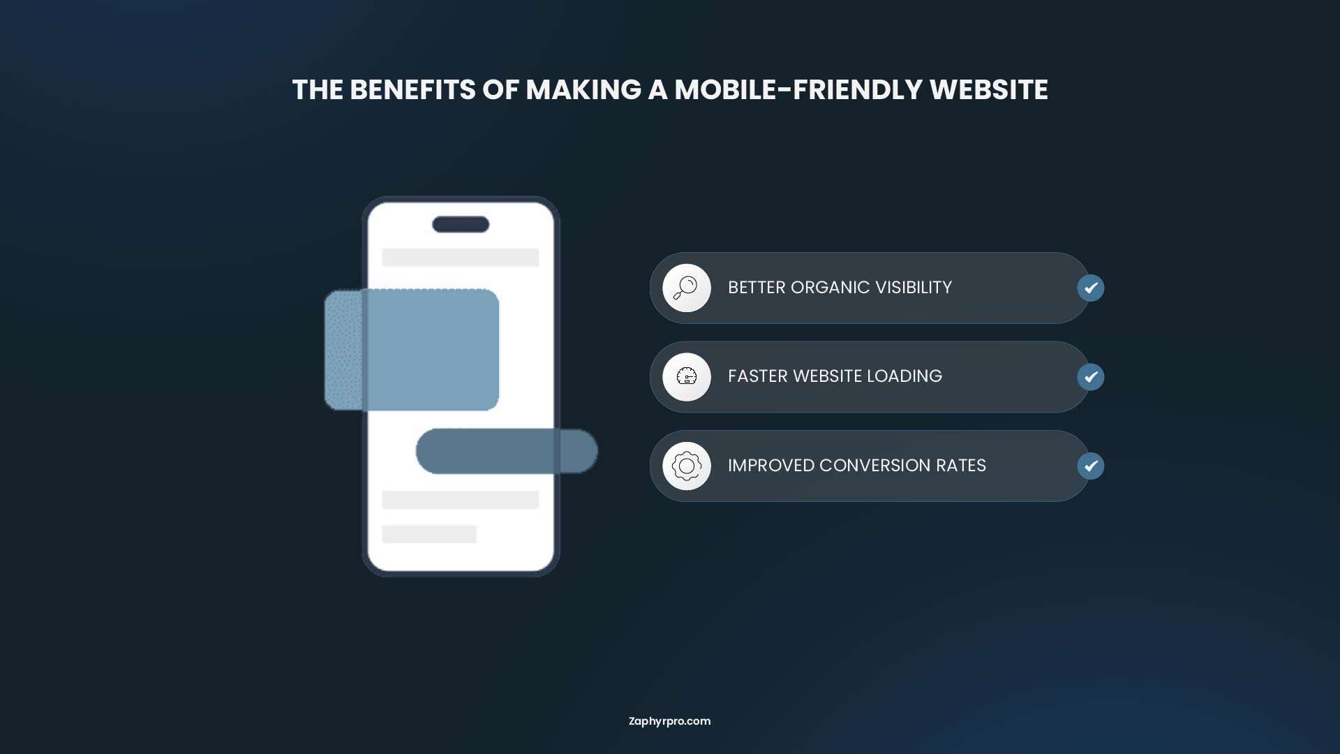
For businesses, mobile SEO also affects how people interact with your website and whether they decide to take action. Here's why it's so important.
- Mobile-First Indexing: Google mainly uses the mobile version of your website for indexing and ranking. If your mobile experience is not good, it can directly reduce your overall visibility in search results, as much as affecting your desktop performance.
- AI Search Visibility: Platforms like Google’s AI Overviews, ChatGPT Search, and Gemini take information from indexed web pages. These AI systems rely heavily on the mobile version of your site. If your mobile pages are slow, hard to access, or blocked, your brand may be less likely to appear in AI-generated answers.
- The “Zero-Click” Shift: Mobile users often search with very clear and immediate intent, such as finding quick answers or “near me” results. Fast, responsive, and well-structured mobile pages are more likely to appear in featured snippets and answer boxes, as much as they are important for getting clicks.
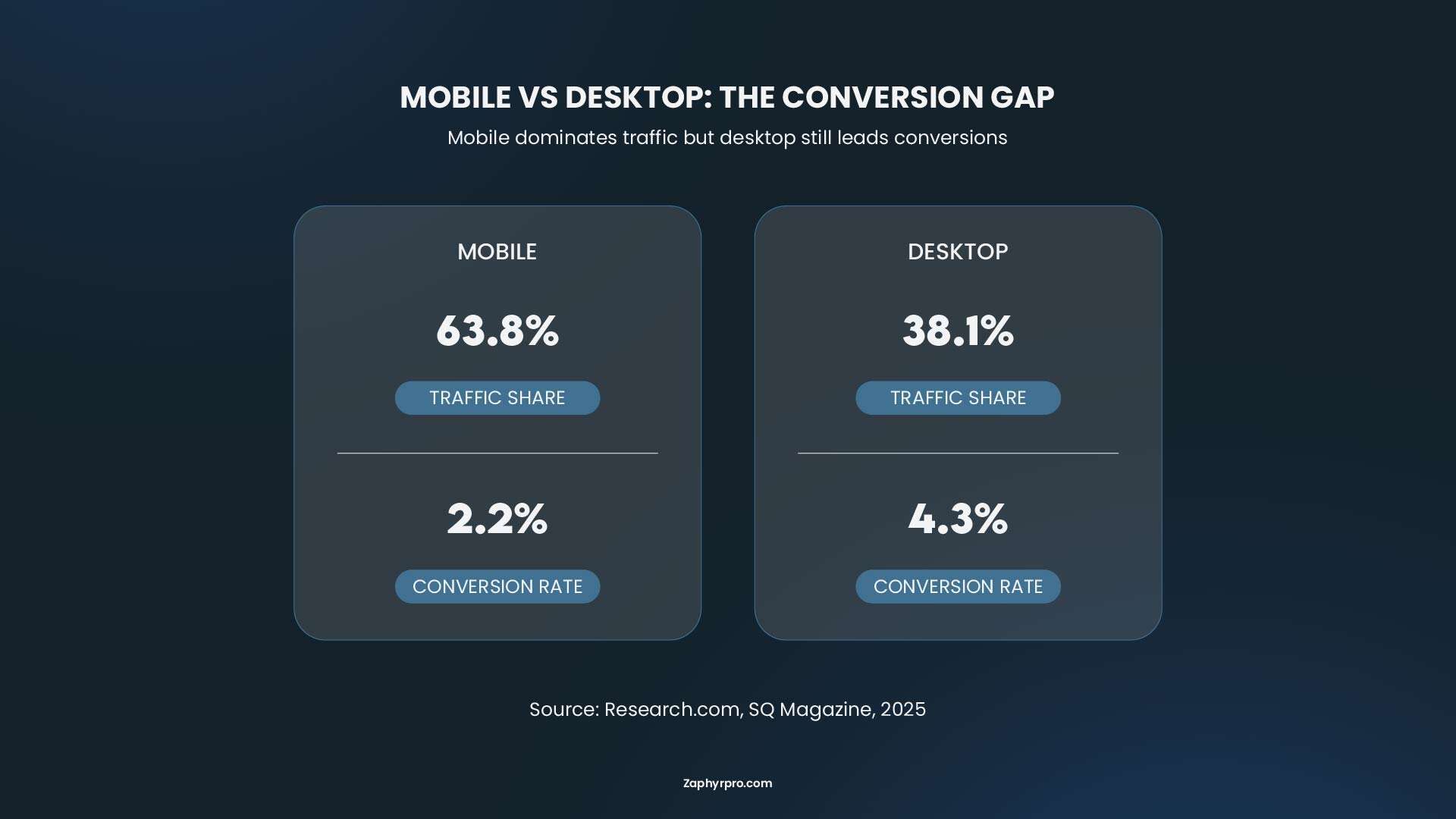
- Higher Conversion Rates: Most traffic in local and retail industries comes from mobile devices. A fast and mobile-friendly website reduces bounce rates, improves user engagement, and leads to more actions such as phone calls, store visits, and online purchases.
Why Mobile Speed Is Different from Desktop Speed
Mobile site performance differs from desktop performance because mobile devices typically have slower processors, less memory, and less stable connections, such as 4G or variable Wi-Fi. User behavior and expectations are also different on mobile.
If you want to purchase a bus ticket quickly while you are on the go, just before the bus arrives, you expect the page to load almost instantly. Mobile users are often "in a hurry," and even a one-second delay can lead to frustration and higher bounce rates.
When it comes to mobile performance optimization, always test and optimize for mobile first. In most cases, mobile scores are worse than desktop scores, so fixing mobile issues naturally improves overall site performance.
Do Core Web Vitals Actually Affect Rankings for Mobile SEO?
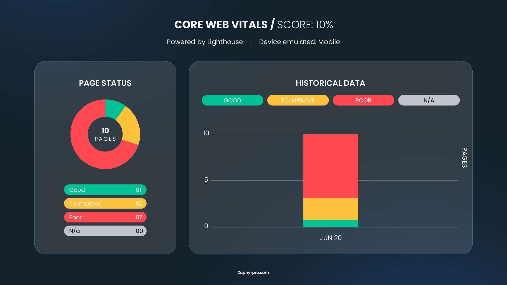
Google has confirmed that content quality and relevance remain the primary ranking factors. A technically perfect site with weak content will not outrank a strong, relevant page just because of better Core Web Vitals.
However, Core Web Vitals do influence rankings indirectly. Poor scores (slow loading, unstable layout, or unresponsive interactions) lead to higher bounce rates, lower time on page, and worse user signals, all of which search engines can observe and factor in.
The practical argument for fixing Core Web Vitals is not just "because Google said so." It is that faster, more stable pages convert better. Every second of LCP improvement can reduce bounce rates by 15 to 20 percent depending on the industry and device mix. For sites that monetize through leads or ecommerce, that is a revenue argument, not just an SEO argument.
How to Check Your Core Web Vitals Scores
There are two types of data to monitor:
- Lab Data (simulated): From tools like Google PageSpeed Insights, Lighthouse, and WebPageTest. Ideal for diagnosing and fixing issues.
- Field Data (real users): Collected via Chrome User Experience Report (CrUX). This is what Google primarily uses for ranking. You’ll see it in the Search Console if your site has enough traffic.
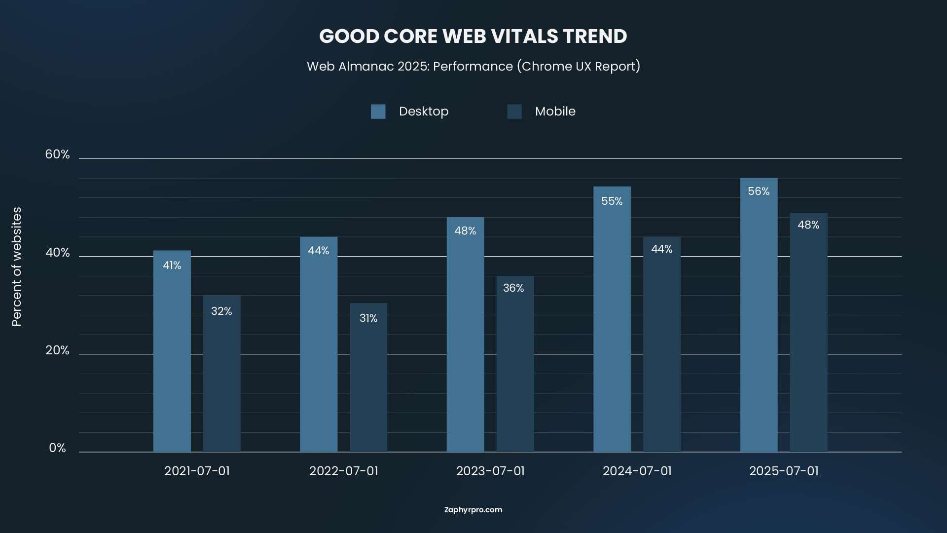
According to HTTP Archive data from 2025, 48% of mobile origins pass all three Core Web Vitals (LCP, INP, and CLS) with a good experience. This is a significant improvement from earlier years (36% in 2023, 44% in 2024), but still means more than half of mobile sites fall short of the benchmark.
Mobile SEO Best Practices for 2026
Now that you understand what mobile SEO is and why it matters, let's look at the practical steps you can take to optimize your website. These best practices improve both the user experience and your website's ability to perform well in search results.
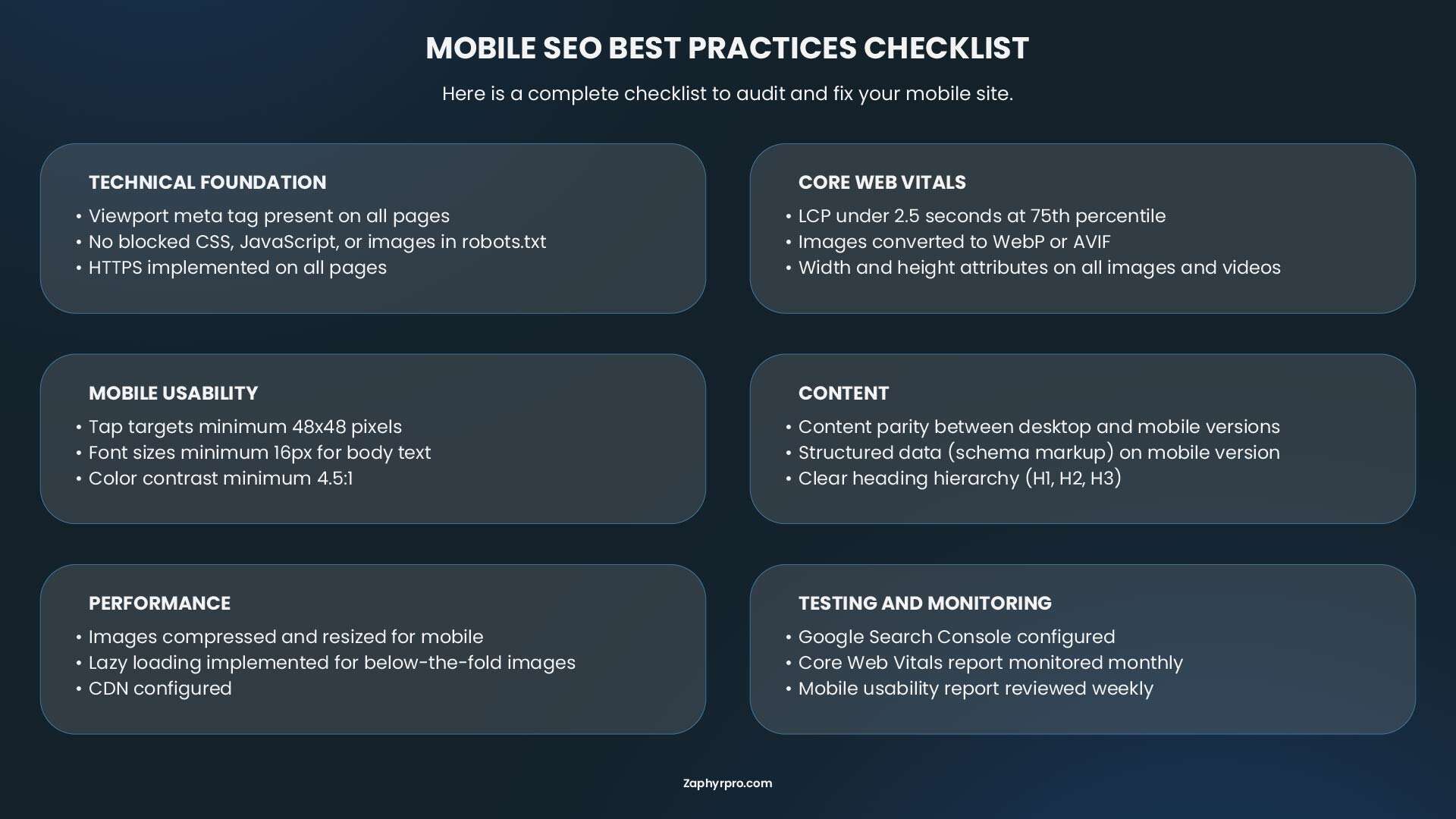
1. Use Responsive Web Design
Responsive web design ensures your website automatically adapts to different screen sizes, so visitors have the same experience whether they're using a smartphone, tablet, or desktop. Instead of maintaining separate mobile and desktop sites, you only need one version that's optimized for every device.
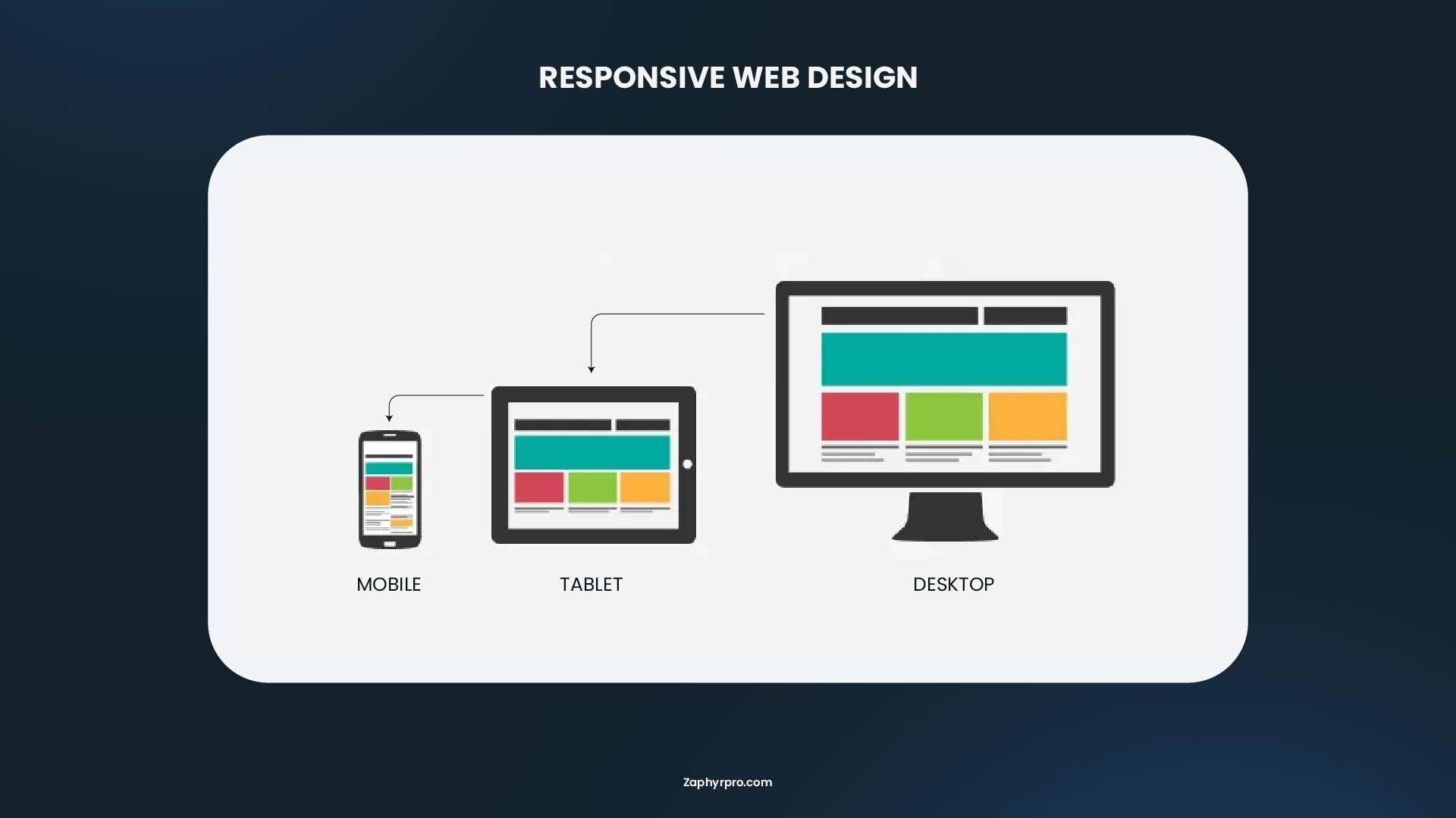
Here’s how to do it well:
- Use a responsive framework or theme: If you’re using WordPress, choose a responsive theme and test it on multiple devices before publishing.
- Keep the same content across devices: Avoid hiding important text, images, or internal links on mobile. Search engines and users should see the same valuable information regardless of screen size.
- Design for thumbs, not mouse clicks: Buttons should be large enough to tap comfortably, with enough spacing to prevent accidental clicks.
- Avoid fixed-width layouts: Your content should automatically resize instead of forcing users to scroll horizontally.
- Test regularly: Open your website on different phones and tablets. Check whether menus, forms, images, and CTAs work as expected.
2. Improve Mobile Page Speed
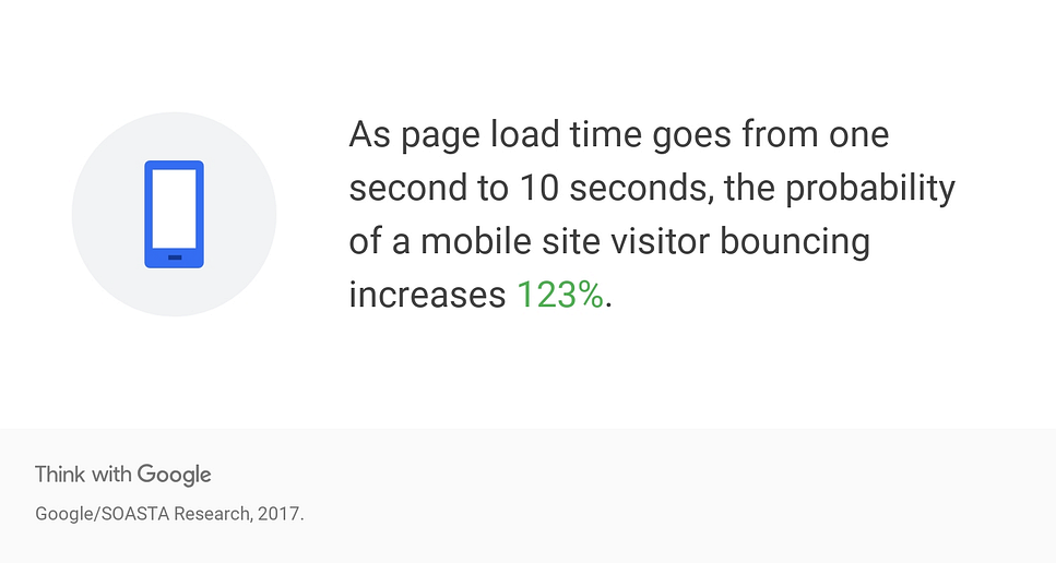
Page speed is one of the most important ranking and conversion factors in mobile SEO. When users visit your site on a phone, they expect it to load almost instantly. According to Google, over 50% of mobile users abandon a page if it takes longer than 3 seconds to load, which means even small delays can directly cost you traffic and sales.
Here’s how to improve your mobile page speed:
- Reduce unnecessary JavaScript and CSS: Many websites load scripts that visitors never actually use. Remove outdated plugins, eliminate unused CSS, and defer non-essential JavaScript so browsers can display visible content sooner.
- Enable browser caching: Caching allows returning visitors to load your pages much faster by storing certain website files on their devices instead of downloading them every time.
- Use a Content Delivery Network (CDN): A CDN stores copies of your website across servers around the world, allowing users to download content from the server closest to them. This significantly improves loading times, especially for businesses serving customers across multiple countries.
- Choose reliable web hosting: Even a perfectly optimized website can feel slow if it’s hosted on an overloaded server. Upgrading to quality hosting often delivers noticeable performance improvements without changing your website itself.
- Monitor Core Web Vitals regularly: Google uses Core Web Vitals to evaluate the real-world user experience of your website. The current benchmarks are:
- Largest Contentful Paint (LCP): under 2.5 seconds
- Interaction to Next Paint (INP): under 200 milliseconds
- Cumulative Layout Shift (CLS): below 0.1
- Largest Contentful Paint (LCP): under 2.5 seconds
Google’s Chrome UX Report suggests that roughly half of sites pass all Core Web Vitals, with mobile generally lagging behind desktop. That gap creates a clear opportunity for businesses that invest in faster, smoother user experiences.
3. Make Your Content Easy to Read on Mobile
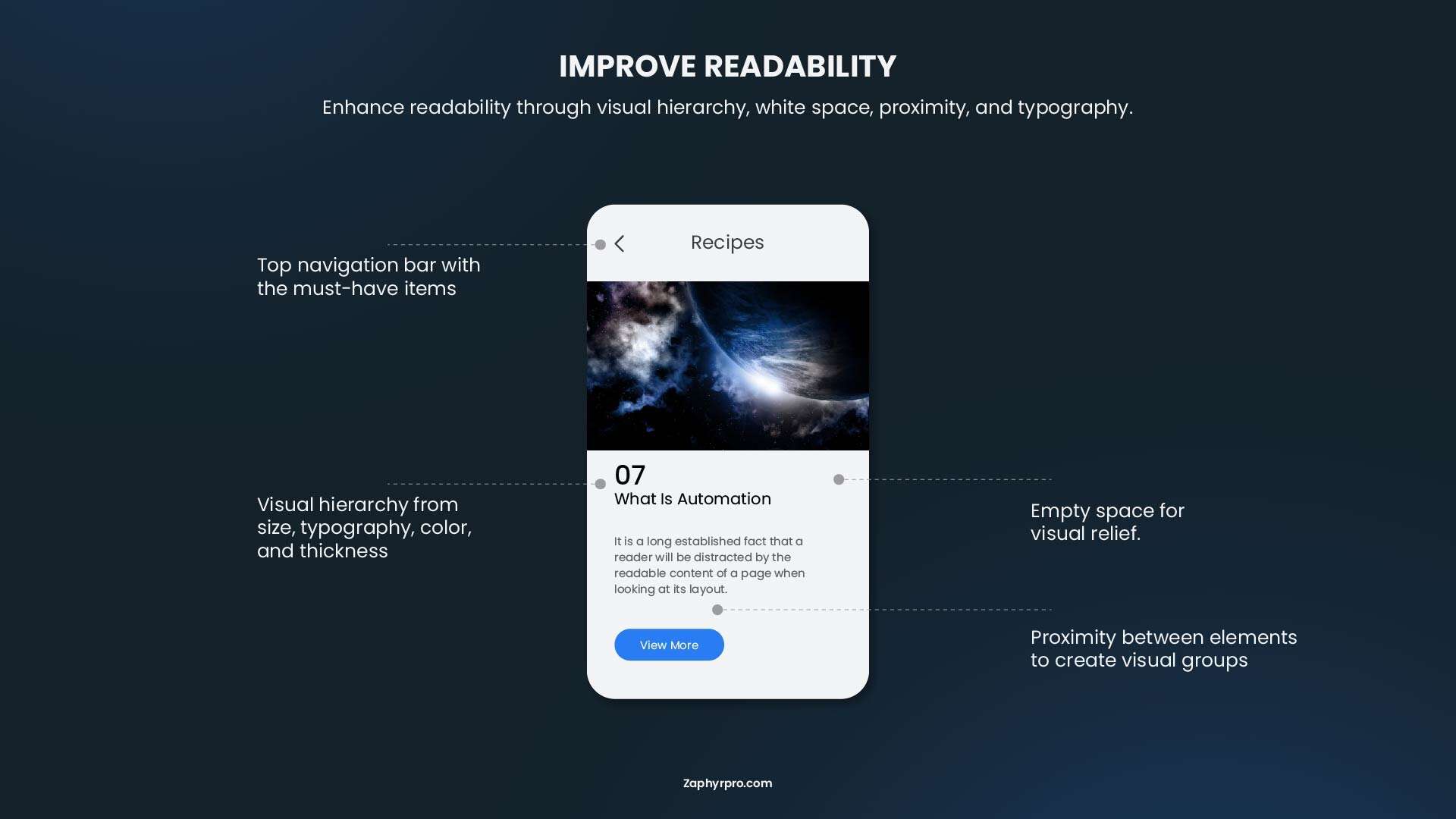
Good formatting makes content easier to follow on smaller screens. A clean layout helps visitors move through the page and find the information they need without extra effort. Here are a few simple ways to improve readability:
Best practices for mobile-friendly content
- Keep paragraphs short, typically 2 to 4 lines.
- Use descriptive headings to break up long sections.
- Write in plain, conversational language.
- Include bullet points and numbered lists whenever possible.
- Leave plenty of white space between sections.
- Highlight important information using bold text sparingly.
Before publishing, analyze the content from your phone. If the layout feels clean and the content is easy to follow without zooming or excessive scrolling, your readers will have a much better experience.
4. Optimize for Mobile-First Indexing
Since July 5, 2024, Google has completed the transition to mobile-first indexing. This means Google primarily crawls and evaluates the mobile version of your website when determining rankings.
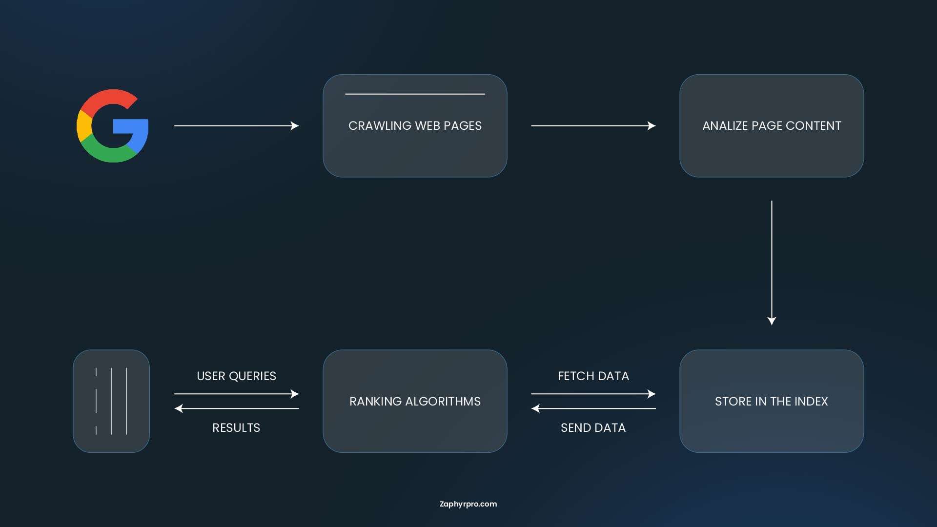
If your mobile site contains less content than your desktop version or important pages aren't accessible on smaller screens, your rankings can suffer.
Checklist for mobile-first indexing
- Display the same primary content on both desktop and mobile.
- Keep structured data consistent across devices.
- Ensure meta titles and descriptions remain identical.
- Make all internal links accessible on mobile.
- Allow Googlebot to crawl CSS, JavaScript, and image files.
- Avoid hiding valuable content behind expandable sections unless it genuinely improves usability.
5. Create Mobile-Friendly Navigation
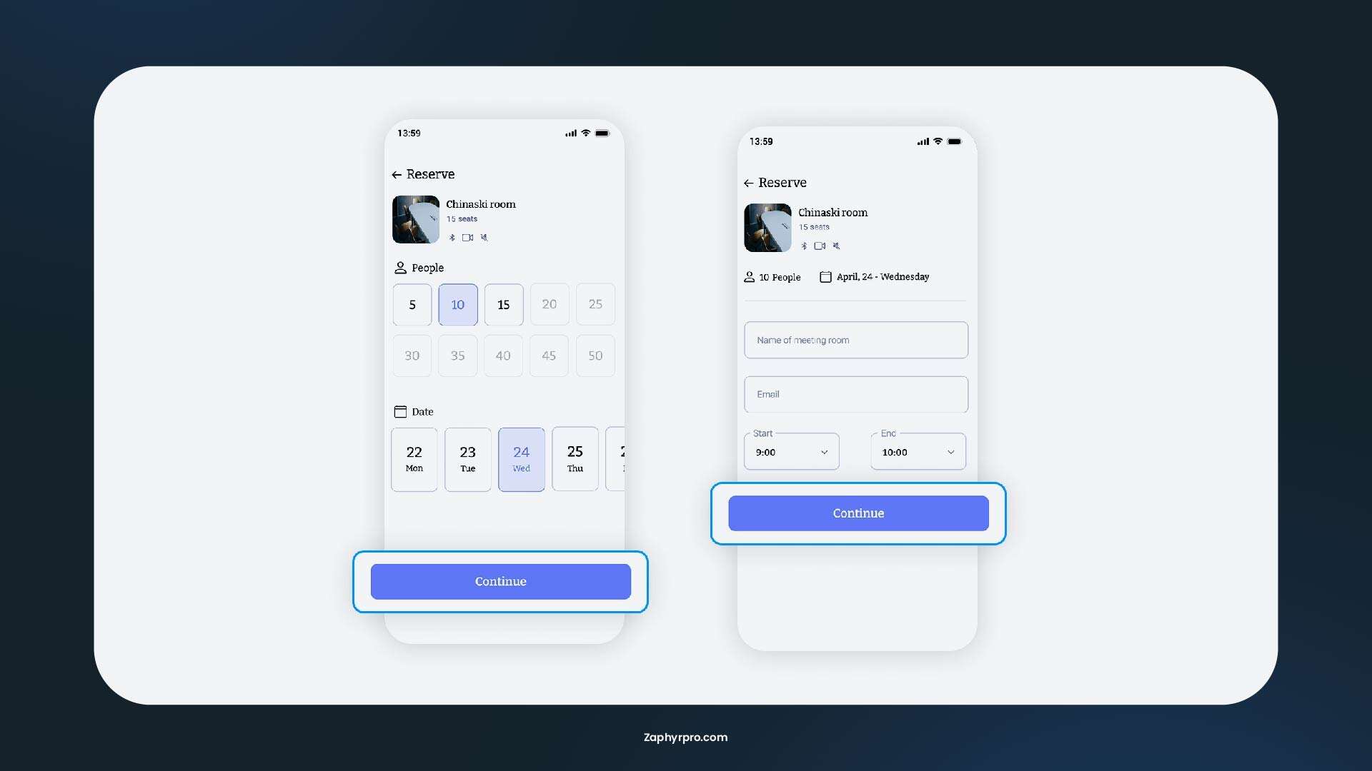
Navigation should feel effortless on a smartphone. Visitors should never struggle to find your products, services, or contact information. Simple navigation also helps search engines crawl your website more efficiently.
Tips for better mobile navigation
- Keep menus simple and organized.
- Limit the number of top-level navigation items.
- Make buttons large enough to tap comfortably.
- Leave enough spacing between clickable elements.
- Include a visible search function on larger websites.
- Make your phone number and contact buttons easy to find.
Sticky navigation can also improve usability by keeping important actions (such as contacting your business or requesting a quote) within easy reach as users scroll.
6. Avoid Intrusive Popups (Without Hurting Conversions)
Popups can still be useful in mobile SEO when used carefully, but the problem is how aggressively they interrupt the user experience. On mobile screens, even a small interruption feels bigger because it covers most of the content and forces immediate action.
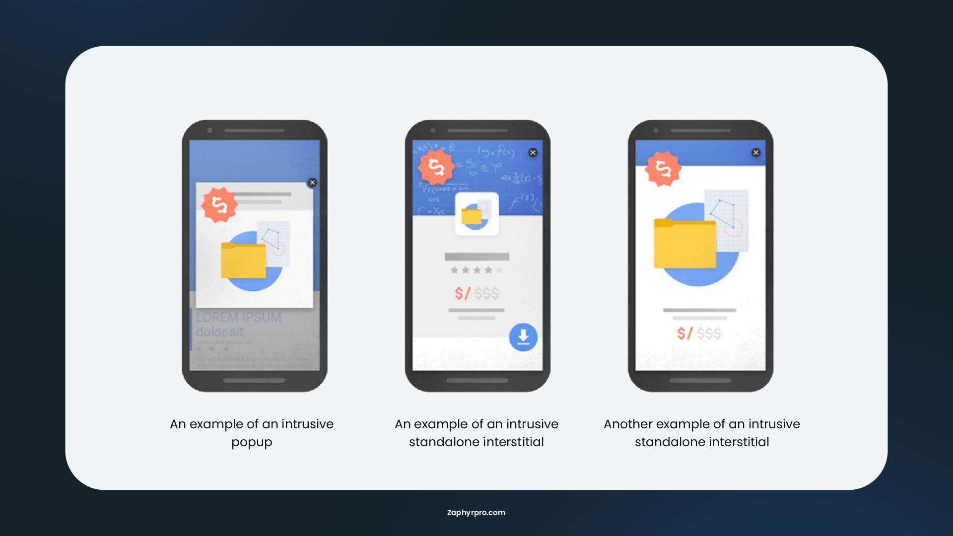
Google also evaluates intrusive interstitials as part of page experience signals, especially when they block access to the main content right after a user lands on a page. This can negatively affect both rankings and engagement.
What to avoid
- Full-screen popups that appear immediately on page load
- Popups that are difficult to close on mobile devices
- Multiple popups stacking on top of each other
- Content hidden behind popups without user intent
Better mobile-friendly alternatives
- Slide-in banners: These appear subtly from the bottom or side without blocking content
- Delayed popups: Show after a user has engaged with the page for a few seconds or scrolled
- Exit-intent offers: Trigger only when the user is about to leave (especially useful for promotions)
- Embedded forms: Place newsletter or lead forms directly within content sections
- Sticky bars: Thin, non-intrusive banners at the top or bottom of the screen
If you use pop-ups, keep the modal window small and make sure it does not disrupt the viewing experience by covering the main content. Google actively penalizes pages where pop-ups make content hard to access right after arriving from search.
7. Optimize Images and Videos for Mobile Performance
Visual content plays a major role in engagement, especially on mobile devices where users tend to scroll quickly and respond better to visual cues. However, unoptimized media is one of the most common causes of slow mobile performance. The goal is to strike a balance between quality and performance so your visuals load fast without losing clarity.
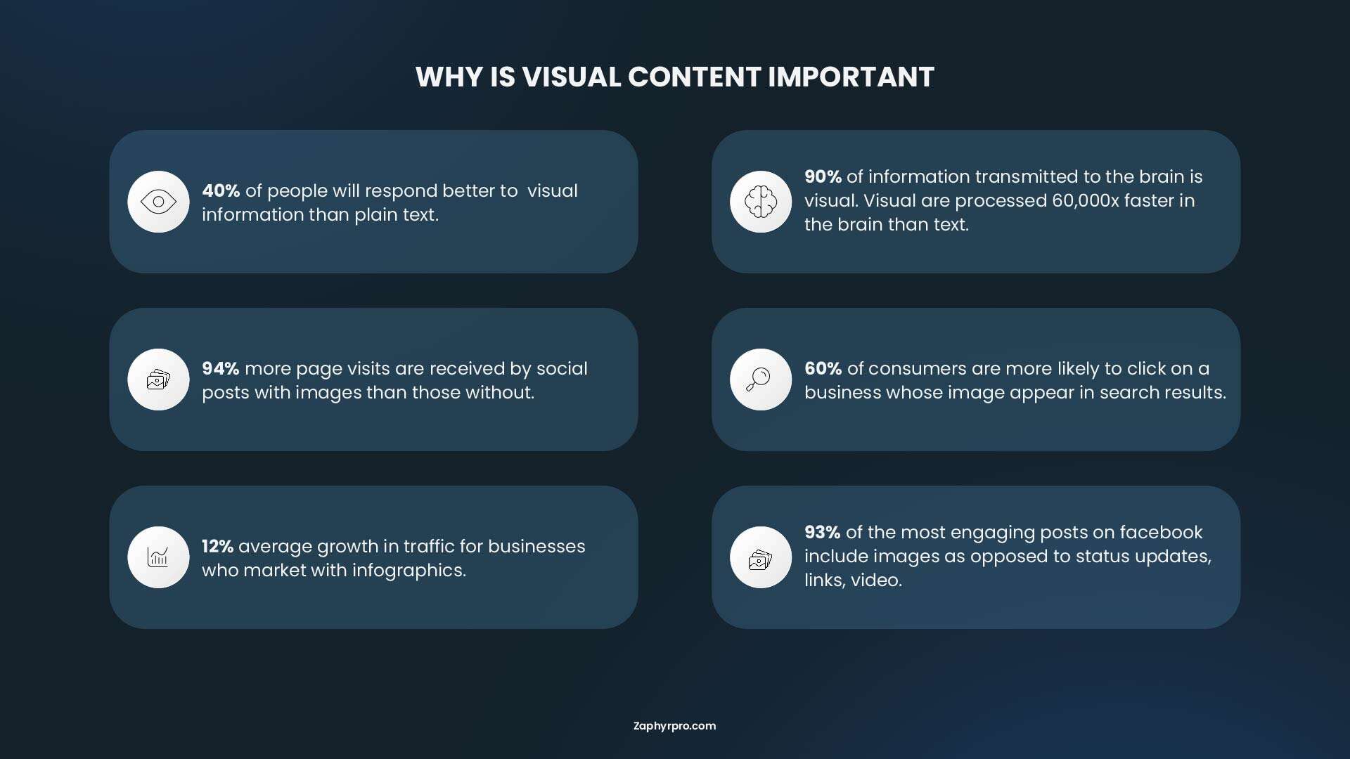
Image optimization tips
- Compress images before uploading.
- Use next-generation formats like WebP or AVIF.
- Add descriptive alt text for accessibility and image SEO.
- Enable lazy loading so off-screen images load only when needed.
Video optimization tips
- Avoid autoplay with sound.
- Compress video files when self-hosting.
- Use responsive video players.
- Consider embedding videos from platforms like YouTube to reduce server load.
Every image or video should justify its performance cost. If it doesn’t improve understanding, engagement, or conversion, it may be slowing your site down unnecessarily.
8. Optimize for Local Mobile Searches
Mobile search behavior is strongly tied to immediate intent, especially for local queries. Users often search while actively looking for a place or service nearby, meaning they are much closer to taking action compared to desktop users.
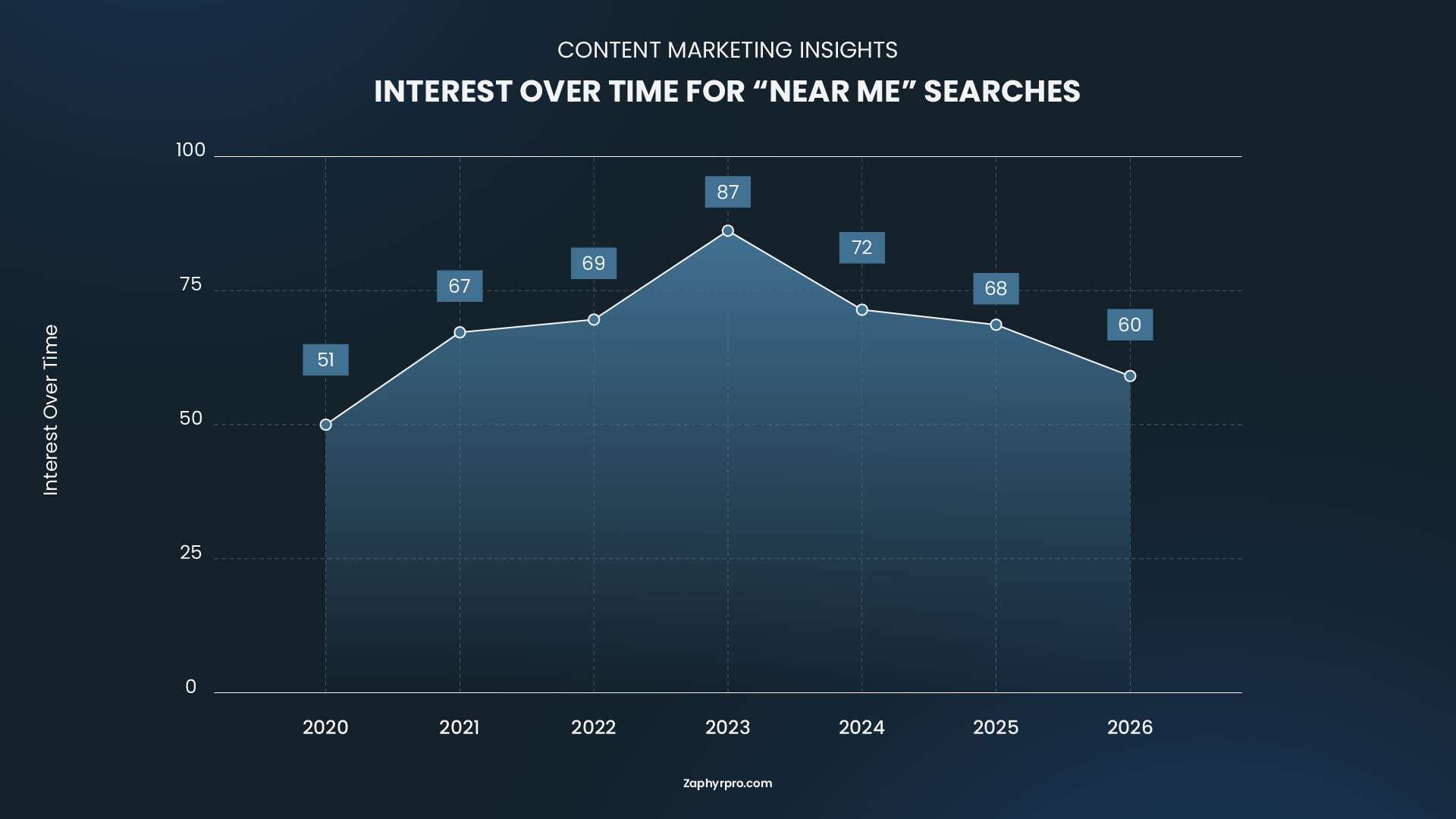
This makes local mobile SEO one of the highest-impact opportunities for many businesses.
People search for phrases like:
- "coffee shop near me"
- "emergency plumber"
- "dentist open now"
These searches often lead to quick decisions, such as visiting a store, making a call, or booking a service within minutes.
Core optimization areas
- Keeping your Google Business Profile complete and up to date.
- Maintaining consistent Name, Address, and Phone Number (NAP) across the web.
- Collecting authentic customer reviews.
- Creating location-specific landing pages when serving multiple cities.
- Embedding maps and making directions easy to access.
According to Google, a large percentage of mobile users who perform local searches visit or contact a business shortly afterward, making local optimization one of the highest-ROI SEO activities.
9. Structure Content for AI Overviews and Featured Results
Search is evolving rapidly with the rise of Google AI Overviews.
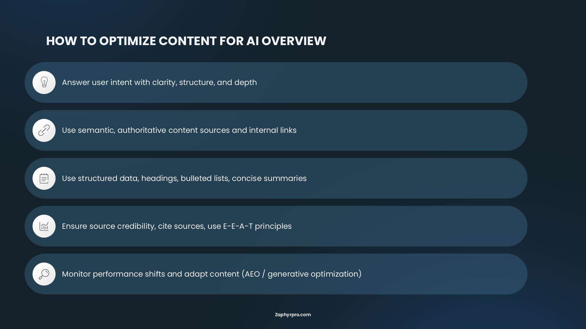
Instead of simply displaying ten blue links, Google increasingly summarizes information directly within search results. Websites with clear, trustworthy, and well-structured content are more likely to be referenced in these AI-generated responses.
How to optimize for AI-driven search
- Answer the primary question early.
- Use descriptive H2 and H3 headings.
- Include concise summaries before diving into details.
- Support important claims with reputable sources.
- Add FAQ sections where relevant.
- Implement structured data whenever appropriate.
The easier your content is for both people and search engines to understand, the greater your opportunity to earn visibility beyond traditional rankings.
10. Test Your Mobile Experience Regularly
Because Google indexes your mobile site, all important content must appear on your mobile version. If you need to simplify a page for mobile, try to retain key elements. For example, if a help article includes a tutorial video, avoid removing it to optimize load speed. Instead, consider serving a lower-resolution version or using adaptive streaming to maintain fast performance while keeping the video clear.
Changes such as installing new plugins, updating your theme, adding scripts, or modifying layouts can all introduce mobile issues without immediately being obvious. That’s why regular testing is essential to ensure your site continues to deliver a smooth experience across all devices.
Pay close attention to:
- Loading speed
- Core Web Vitals
- Navigation
- Form usability
- Clickable elements
- Responsive layouts
- Broken links
Beyond just checking technical scores, the real focus should be on how your website feels to a mobile user. For example, does the page load quickly enough on a real mobile network? Are buttons easy to tap without zooming? Do forms work smoothly without frustration?
Routine testing helps you catch small issues early, before they accumulate into bigger problems that negatively affect search performance, user experience, or conversion rates.
11. Optimize for Voice Search & Conversational Queries
Voice search has become a major part of mobile behavior, especially as users rely more on assistants like Google Assistant and voice-enabled search on smartphones. According to data from Yaguara, about one in four people in the U.S. use voice search on their mobile devices daily.
How to optimize for voice search
- Write in natural question and answer format
- Target full questions instead of short keywords
- Place direct answers early in the section
- Use simple sentences that sound natural when read aloud
- Include phrases like “near me” or “open now” where relevant
- Cover common spoken queries in your FAQs
12. Improve Accessibility for Better UX & SEO Performance
Accessibility improves how real users interact with your website, especially on mobile where screens are small and interaction is touch-based. It also helps search engines better understand your pages.
Many accessibility issues overlap with mobile usability problems, such as small text, unclear buttons, or poor contrast.
What to focus on
- Use readable font sizes (at least 16px)
- Keep strong contrast between text and background
- Make buttons large and easy to tap
- Leave space between clickable elements
- Add alt text for images
- Keep forms simple and easy to complete on mobile
13. Use Structured Data to Clarify Your Content
Structured data helps search engines understand your content more clearly. It does not change how your page looks, but it improves how your content is interpreted and displayed in search results.
This is especially useful for mobile search, where Google often shows rich results or short summaries instead of full pages.
Technical Mobile SEO best practices
- Use JSON-LD format for implementation
- Add schema that matches page content
- Common types include Article, FAQPage, and HowTo
- Keep schema consistent with visible content
- Avoid adding irrelevant or misleading markup
Where it helps most
- FAQ results
- Featured snippets
- AI-generated summaries
- Rich results like guides or step lists
14. Consider Progressive Web App Features
A Progressive Web App (PWA) improves the mobile experience by making a website feel more like an app. It is not required for every site, but it can be useful for platforms that rely on repeat visits or user engagement.
What PWAs improve
- Faster repeat loading through caching
- Offline or low connection access
- App-like navigation
- Ability to install the site on the home screen
- Smoother transitions between pages
Best suited for
- Online stores
- Booking systems
- SaaS platforms
- Content platforms with frequent visits
15. Strengthen Website Trust and Security Signals
Mobile users decide quickly whether a site feels safe or not. If anything feels suspicious, slow, or unclear, they leave immediately. Trust is not only about design but also about how secure and transparent your site feels.
What to improve
- Use HTTPS across the entire site
- Avoid mixed content issues (HTTP inside HTTPS pages)
- Keep cookie banners simple and non-blocking
- Show clear contact information
- Make privacy and policy pages easy to access
- Ensure forms are secure and clearly labeled
16. Build Content Credibility with Clear Signals
Search engines and AI systems prefer content that shows clear signs of real experience and reliability. This is especially important for mobile search, where users expect fast and trustworthy answers.
How to improve content credibility
- Add author name and short bio on important pages
- Show last updated date on content pages
- Keep information accurate and updated
- Use real examples or practical insights
- Avoid vague or unsupported claims
- Add references when sharing data or facts
Helpful additions
- Short “about the author” section
- Visible update history for major pages
- Clear ownership of content
Common Mobile SEO Mistakes to Avoid
| ❌ Mistake | ✅ Best Practice |
|---|---|
| Blocking CSS, JavaScript, or images in robots.txt | Allow Google to crawl all resources needed to render your pages correctly. |
| Different content on mobile and desktop | Keep important content, headings, and structured data consistent across both versions. |
| Missing the viewport meta tag | Use a responsive viewport so pages display correctly on every screen size. |
| Content hidden behind non-crawlable interactions | Make sure important content is available in the HTML and crawlable without user interaction. |
| Poor mobile navigation and forms | Use easy-to-tap menus, click-to-call buttons, autofill-friendly forms, and clear navigation. |
| Heavy JavaScript that delays content | Render important content quickly and avoid relying entirely on client-side JavaScript. |
- Blocked resources in robots.txt: This is the most frequent failure. Many sites block CSS, JavaScript, or image directories in robots.txt, thinking this saves crawl budget or improves security. It does not. It breaks your site. Google needs CSS to understand your page layout, JavaScript to see dynamic content, and images to understand visual context. Never block these resources.
- Content parity issues between desktop and mobile: Sometimes site owners choose a simpler mobile layout to make content more scannable on small screens. But because Google indexes your mobile site, all important content must appear on your mobile Fversion. If Google cannot see it on mobile, it does not count, and your ranking signals get weaker.
- Missing viewport configuration: Pages without the viewport meta tag are rendered at desktop width and scaled down. Text becomes unreadable without zooming. Users must pinch to read content. Google flags these pages as having mobile usability issues.
- Hidden content behind interactions: Content hidden behind accordions, tabs, or click-to-expand elements must still be crawlable. Google can crawl content that is present in the DOM but hidden with CSS. However, if content requires user interaction to become visible, and that interaction cannot be performed by a crawler, Google will not see that content.
- Slow or broken mobile navigation & UX: Hamburger menus that don’t open properly, deep nested menus, no sticky navigation for key actions, or forms that are hard to fill on mobile (tiny inputs, no auto-fill support). Also, missing “Click to Call” on phone numbers.
- Over-reliance on client-side rendering (Heavy JS): SPAs or frameworks where critical content loads only via JavaScript that crawlers struggle with (even though Google is better now, delays or failures still occur).
How to Verify Google Sees Your Mobile Site?
You can check whether Google is properly crawling your mobile site using Google Search Console, and this is one of the most important checks for mobile SEO.
- Start with the URL Inspection tool. Enter any page from your site and look at how Google is crawling it. You should see something like “Crawled as: Googlebot Smartphone”. This confirms that Google is using its mobile crawler, which is expected under mobile-first indexing.
- After that, check the Page indexing details in the same report. Look at the rendered version of the page and compare it with what users actually see on a phone. If important content, images, or navigation elements are missing in the rendered view, it means Google may not be seeing your full mobile experience.
- You can also go to Settings > Crawl stats in Search Console. Here, you can review which Googlebot is most active on your site. For a healthy mobile-first site, the majority of crawl activity should come from Googlebot Smartphone. This shows that Google is prioritizing your mobile version.
If you see Googlebot Desktop as the main crawler instead of Smartphone, that is a warning sign. It usually means your site is not fully aligned with mobile-first indexing or Google is having trouble accessing your mobile version properly. This can happen due to blocked resources, inconsistent mobile content, or rendering issues.
Finally, you should also compare how your pages appear in Google results versus how they load on a real mobile device. If the content is missing or different in Search Console’s rendered view, it often indicates a crawling or rendering problem that needs to be fixed.
Best Ways to Configure a Mobile Website in 2026
There are three main ways to configure a website for mobile devices, and each one affects how your site performs in search results, how easy it is to manage, and how users experience your pages:
Responsive Web Design (Recommended)
This is the best option. You use one website and one URL, and the layout automatically adjusts to different screen sizes using CSS. It is simple, clean, and reliable. All your content stays in one place, so you only need to update it once. Google can also crawl and index everything more easily, and all ranking signals stay on a single URL. Users get a consistent experience whether they are on mobile, tablet, or desktop.
Dynamic Serving (Works, but complex)
This setup uses one URL, but the server delivers different HTML depending on the device. It can work well when done correctly, but it is more technical and harder to maintain. Device detection does not always work perfectly, especially with new or uncommon devices. It also requires proper configuration of the Vary: User-Agent header. For most websites, the extra complexity is not necessary compared to responsive design.
Separate Mobile URLs (Not recommended)
This approach uses a completely separate mobile version of the site, usually on a subdomain like m.example.com. It is now outdated and not recommended. You need to manage two versions of every page, which doubles the work for updates and increases the chance of inconsistencies. SEO signals are also split between two URLs, and incorrect redirects or canonical tags can easily cause problems. Google has moved away from this setup in favor of single responsive websites.
Best Mobile SEO Tools You Should Use in 2026
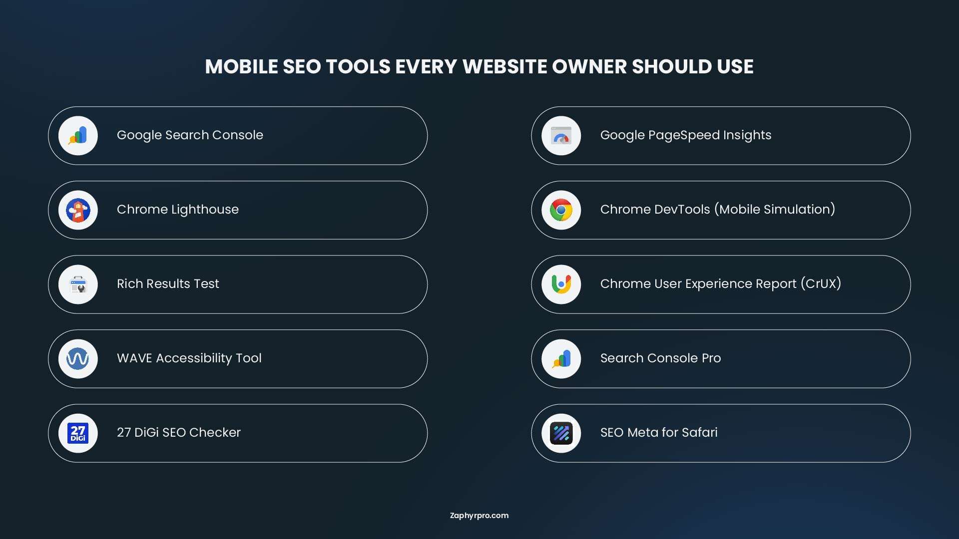
To improve mobile SEO, you also need tools that show how your site actually performs on real devices, networks, and search results. These tools help you find speed issues, mobile usability problems, and indexing errors before they affect rankings or conversions. Here are the most effective tools for 2026, broken down by what they help you accomplish:
Tool Selection by Use Case
| Use Case | Recommended Tools |
|---|---|
| Daily monitoring | Google Search Console, Search Console Pro |
| Speed testing | PageSpeed Insights, Lighthouse, CrUX |
| Deep technical audits | Screaming Frog, 27 DiGi SEO Checker, SEO Meta for Safari |
| Competitor analysis | Semrush, SE Ranking |
| AI search visibility | Semrush, Pro Rank Tracker |
| Content optimization | Pulser AI, SEO Cocoon |
| Mobile rendering checks | Mobile-Friendly Test, Chrome DevTools device toolbar |
Free Tools from Google
- Google Search Console: This is the most important tool for mobile SEO. It shows how Google sees your website and whether your pages are properly indexed for mobile-first crawling. You can check mobile usability reports, indexing status, and performance in mobile search results. The URL Inspection tool also lets you see how Google renders your pages on a smartphone crawler.
- Google PageSpeed Insights: PageSpeed Insights measures how fast your pages load on mobile devices and highlights what is slowing them down. It also reports Core Web Vitals like loading speed, layout stability, and interaction delay. The tool gives clear suggestions such as reducing image size, improving server response, or removing unused scripts.
- Chrome’s Lighthouse: Lighthouse is a built-in audit tool inside Chrome. It checks performance, accessibility, SEO, and best practices for mobile pages. It is useful for finding technical issues like slow rendering, missing meta tags, or poor mobile usability directly during development or testing.
- Chrome DevTools (Mobile Simulation): Chrome DevTools allows you to test how your site behaves on different screen sizes and devices. You can simulate mobile phones, check responsive layouts, and debug issues like overlapping elements, broken menus, or slow loading sections.
- Rich Results Test: This tool checks whether your structured data is valid and eligible for rich results in Google. It helps ensure that your FAQs, articles, or product pages can appear in enhanced search formats, which is especially useful for mobile search visibility.
- WAVE Accessibility Tool: WAVE helps you identify accessibility issues that also affect mobile usability. It highlights problems like low contrast text, missing labels, and unclear navigation elements. Fixing these issues improves both user experience and SEO performance.
- Chrome User Experience Report (CrUX): This provides field data for millions of origins. Access it through PageSpeed Insights, Search Console, or the CrUX API. CrUX data is what Google actually uses for ranking. Lab tests are useful for debugging, but field data is the truth.
Mobile-Specific Testing Tools
- Search Console Pro: It is a dedicated mobile app that brings Google Search Console data to your iPhone. It tracks clicks, impressions, CTR, and average position with interactive charts. You can check indexing status, request recrawling, and manage sitemaps directly from your phone. The app stores reports locally for offline access and sends AI-powered alerts when traffic spikes or indexing changes occur. Available on the App Store for iOS 17 and later with a freemium model.
- 27 DiGi SEO Checker: It is a Chrome extension that runs technical on-page analysis directly in your browser. It validates meta tags, heading hierarchy, image alt text, lazy load implementation, and link profiles. The latest version (v1.2.0, released February 2026) includes a fully responsive report layout for mobile devices, visual Google and social media previewers, and section-specific performance scoring. All data processes locally in your browser, with nothing uploaded to external servers.
- SEO Meta for Safari: It is an extension for iOS, iPadOS, and macOS that provides instant on-page SEO analysis. It audits canonical tags, titles, descriptions, H1 tags, indexation settings, headers, internal and external links, image alt text, and schema markup. The extension works seamlessly across Apple devices and costs $2.99 with no recurring subscription. The developer collects no data from users.
What to Do Next: Your 30-Day Mobile SEO Action Plan
If you have come this far, you now have a complete understanding of what Google expects from mobile sites in 2026. A 30-day plan helps you focus on the most important issues first, then build a stable and fast mobile experience over time. The goal is to remove technical problems, improve usability, and make sure Google can fully understand your mobile pages.
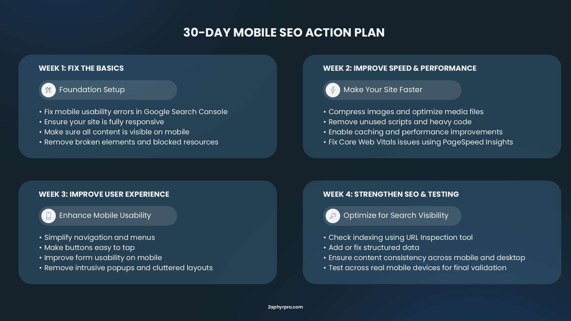
Week 1: Fix the basics
Start by making sure your site is fully accessible and mobile friendly. Check your pages in Google Search Console and fix any mobile usability errors. Confirm that your site uses a responsive layout and that all content is visible on mobile. Also make sure your pages load correctly without broken elements or blocked resources.
Week 2: Improve speed and performance
Focus on page speed and Core Web Vitals. Compress images, remove unused scripts, and enable caching if it is not already active. Test your pages using PageSpeed Insights and fix the biggest issues first, especially slow loading elements and layout shifts. Your goal is to make the mobile experience fast and stable.
Week 3: Improve user experience
Now focus on how users interact with your site. Simplify navigation so visitors can find key pages quickly. Make buttons easy to tap and forms easy to complete on mobile. Remove anything that blocks content or creates frustration, such as intrusive popups or cluttered layouts.
Week 4: Strengthen SEO signals and testing
In the final week, focus on search visibility and consistency. Check how Google is indexing your mobile pages using the URL Inspection tool. Add or fix structured data where needed. Review your content to ensure it is clear, readable, and consistent across mobile and desktop. Then test your site on real mobile devices to confirm everything works smoothly.
Need Help Improving Your Mobile SEO?
A 30-day mobile SEO best practices plan can feel simple when you read it, but in real work it takes time, tools, and constant attention. You need to check technical issues, fix performance problems, improve user experience, and keep testing as your site changes. For many business owners, this becomes difficult to manage alongside daily operations.
If you are not sure where to start, or you want a clearer view of what is holding your site back, getting a proper audit can help you see the exact problems and priorities. Small fixes in mobile SEO can often lead to noticeable improvements in traffic, rankings, and conversions.
Sometimes all it takes is a conversation about where your mobile site stands today and where it needs to be.
You can reach out to Zaphyre for a consultation to review your website, understand your current mobile performance, and identify the opportunities you may be missing.
Frequently Asked Questions
Mobile SEO is the process of making your website work well for people using phones and tablets. It includes fast loading, easy navigation, readable text, and layouts that adjust to small screens.
Yes. Since 2024 Google has used the mobile version of your site as the main version for indexing and ranking. This is called mobile-first indexing. Your mobile pages must contain the important content.
The three key metrics are Largest Contentful Paint (under 2.5 seconds), Interaction to Next Paint (under 200 milliseconds), and Cumulative Layout Shift (below 0.1). Mobile versions usually need the most attention because they often perform worse than desktop.
Use short paragraphs, clear headings, bullet lists, at least 16 pixel font size, and plenty of space between elements. Put the most important information near the top of the page and make sure everything works without zooming.
Use Google Search Console. Open the URL Inspection tool, enter a page address, and check that it says “Crawled as Googlebot Smartphone”. Also review the rendered page to make sure important content appears.